The world of advertising has evolved over the years into a hugely complicated form of communication. There are thousands of diverse ways for an organization to convey its message to the client. Modern-day advertisers have easy access to a broad spectrum of choices. According to the Balance, Numerous of these are provided by the Internet alone. Advertisers and business owners can leverage the power and versatility of viral videos, advertorials, banners, chat rooms, sponsored websites, and more.
Despite the advent of the digital era, and with it a host of modern advertising methods, businesses have not given up their trust and reliance on some of the old or traditional advertising and promotional techniques. Banners are still very much in vogue and are regarded as effective marketing tools. However, banner printing shops encounter a host of issues or challenges in delivering banners as per customer unique specifications. It is a typical problem faced by vinyl banner printers. They should understand the common mistakes to avoid. Moreover, they must learn from their mistakes.
Not Bothering to Get a Proofreading Done
It is of pivotal importance to get your banner design and format meticulously checked. Proofreading and editing are a must for identifying grammatical or spelling mistakes. It is a big mistake if you skip the proofreading process. Once the banner artwork is ready, you cannot make any amends. Hence, proofreading by experts at the design stage is critical. Even minor spelling mistakes should be rectified or else, your business may appear unprofessional. Your brand message should be clear and free from errors. You need to pay attention to visual design as well. All fonts should be clear and the text should be legible.
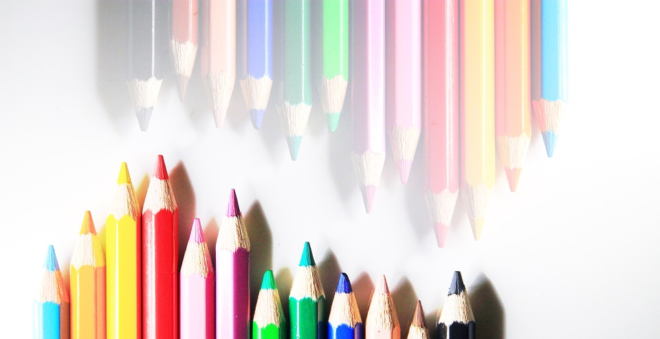
Ignoring RGB & CMYK Issues
RGB is supposed to be an additive color mechanism that mixes light for creating all the colors visible to you. If you go on adding more light, your colors tend to become more vibrant. As opposed to this, CMYK is known to be a subtractive color mechanism that is instrumental in subtracting ratios of colors from pure black for creating tones. It will be a grave mistake if you are neglecting the idea of converting your design files effectively into CMYK. Remember the differences could lead to darker muted colors that may end up making outdoor banners far more challenging to read.
Not Paying Special Attention to Fonts Vis-à-vis Vinyl Banners
Do not make the mistake of not keeping in mind that you are dealing with vinyl banner printing. You need to be smart especially with fonts in the case of printing vinyl banners. Avoid fine or delicate fonts that appear amazing on your computer monitor because they may not prove to be effective on vinyl print. Moreover, often printer ink may not look good against the vinyl background. It is particularly true if you are using cheaper materials and darker colors. It pays to add a dash of boldness while choosing your font for ensuring that it is legible even from a distance.
Conclusion
It is important to consider including a bleed in your banner designs to avoid frustrating and expensive reprints. Always use high-quality materials for happier clients and better outcomes. Always assess the ink compatibility between your printer and your banner media.